Learning Figma: Design Systems, Components, and Mobile-First Design
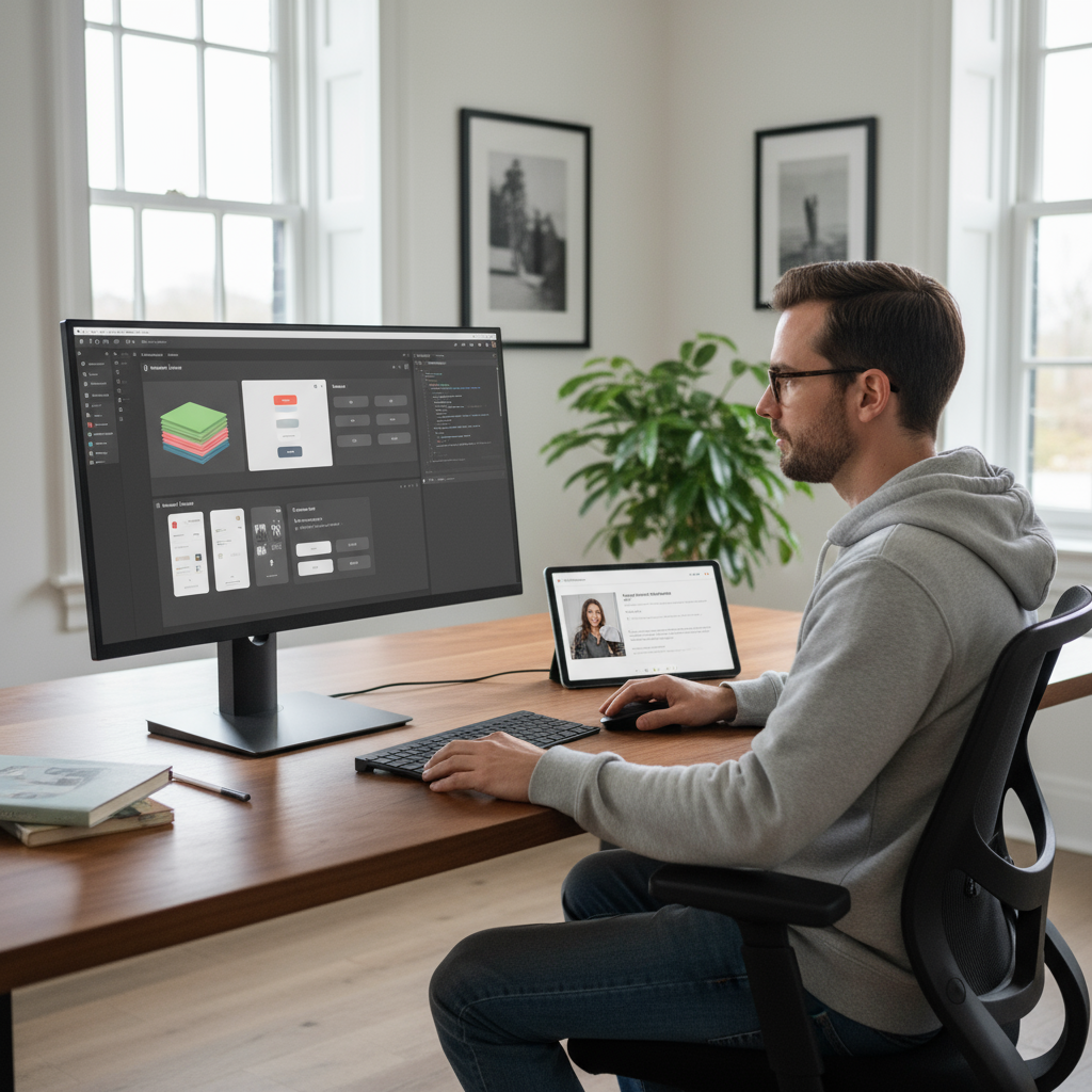
Today I focused on learning Figma and dove deep into several fundamental design concepts that were completely new to me.
Design Systems & Design Tokens
The most eye-opening concept was understanding what a design system really is. I learned about design tokens - the foundational elements that define:
- Colors: Which red is red? Which blue is blue? Defining primary, secondary, and semantic colors (error, success, etc.) in a systematic way
- Typography: Standardizing font sizes - how big is H1, H2, H3? What’s the normal text size? How small is small?
- Spacing: Following either 4px or 8px-based spacing systems for consistency
I’m using Tailwind CSS as my design system foundation since it has pre-built pixel values for spacing and typography. For colors, I’m drawn to Catppuccin’s color palette, so I’ve defined my primary, secondary, and semantic colors based on that beautiful color scheme.
This systematic approach is revolutionary for me - no more guessing “is this red different from my other red?” Everything has a standard.
Component Architecture
Learning about Figma components was fascinating, especially since I already understand components in frontend development. The concepts connect perfectly:
- Components: You can create a component and publish it for the whole team
- Instances: When team members use a component, they create instances. When you update the original component, all instances automatically update - perfect for large projects
- Variants: Components can have properties built in, similar to props in frontend components
- States: hover, disabled, default, normal
- Variables: primary color vs secondary color buttons
The challenge is that building component variants can be tedious - for 2 variables × 2 states, you need to build 4 different buttons in a matrix format. But the flexibility is worth it.
Mobile-First & Responsive Design
I learned about mobile-first design methodology - always start designing for mobile, then scale up to larger screens. It’s much easier to go from small to big than big to small.
This connects to media breakpoints for different screen sizes. Since I’m using Tailwind CSS, I’m following their responsive design system. An interesting insight about Tailwind: when you use sm:, it doesn’t mean “for small screens” - it means “for screens above small size.” Same with md: - it triggers above medium, not on medium. This reinforces the mobile-first thinking.
MVP and Figma Community
I also learned about MVP (Minimum Viable Product) - creating the minimum deliverable thing, even faster than a prototype.
Another great discovery was the Figma Community library. Instead of rebuilding everything from scratch, I can use pre-made components from the community. When I bring these components to code, they’ll look exactly like they do in Figma.
Reflection
This systematic approach to design is completely new territory for me, but I love how everything has standards and consistency. The connection between Figma components and frontend components makes perfect sense, and the mobile-first methodology will definitely change how I approach design projects.
#Figma #Design-Systems #Ui-Design #Learning #Components #Mobile-First